How to Build a Warm, Earthy Bedroom Around Original Art

An art-led interior scheme inspired by What We Keep
Starting with the art
For the second of my art-led interior schemes, I wanted to explore something softer and more restful than the first. This time I used my painting What We Keep.
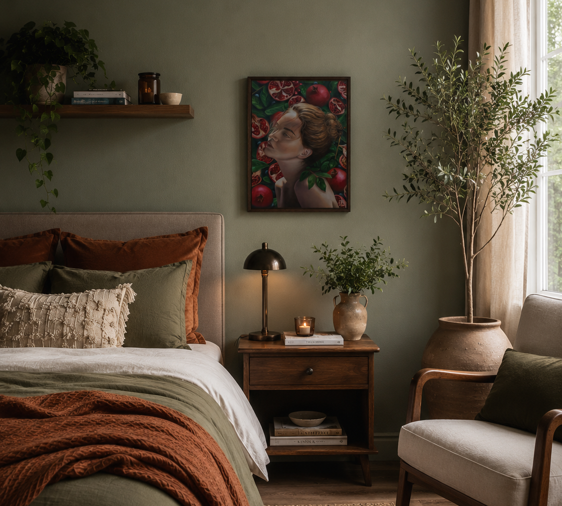
The starting point became a palette of muted sage green, warm walnut, oatmeal linen, soft cream and burnt rust. It explores memory, rest and renewal. Rather than trying to match the painting literally, I wanted to take that richness and translate it into a bedroom that felt cosy and comforting.
Building the scheme
Walls
I wanted the wall colour to connect with the foliage in the painting without recreating its much darker greens.
I chose Sage Green by Little Greene, a muted, desaturated green with a quiet, slightly greyed quality. Little Greene describes it as a colour historically valued for its restful tone, which feels particularly appropriate in a bedroom. Little Greene
It gives the painting enough contrast to remain the focal point while creating a much softer overall room than using one of the deeper greens directly from the canvas. For a bedroom, I’d probably use the Absolute Matt finish; at the time of writing, a 2.5L tin is listed at £73.

Fabric
The Zen Garden Oatmeal Pure Flax Linen Voile was chosen to keep the window treatment very light.
Rather than introducing another strong colour or pattern, the warm oatmeal sheer adds texture and movement while still letting plenty of daylight through. The fabric is extra wide at 280cm and is also available by the metre, which makes it useful for creating long, relaxed curtains with plenty of fullness. voilavoile.com
I particularly like the contrast between something this airy and the dense, dark foliage of the painting.
Furniture
For the bedside table, I chose the Canonbury bedside table from Swoon in dark brown mango wood.
The darker timber helps ground all the pale linen and upholstery and connects back to the warmer browns in the figure's hair and skin. I wanted something with visible character rather than a very pale or minimalist bedside table, because the painting itself has quite a rich visual presence.
The Jensen Mid-Century Armchair does almost the opposite. Its cream upholstery keeps the scheme light, while the exposed oak frame adds just enough warmth and structure. The chair is made from wood and linen, with curved arms and tapered legs, and measures 73cm wide by 71cm deep. The cream version is currently listed at £465. furnish.co.uk
That combination of darker bedside furniture with a much lighter chair stops the room becoming too uniformly beige or heavy.
Lighting
The Charles Table Lamp in Antique Brass brings in a slightly more polished material.
I liked the fact that it isn't overly decorative. The style of this lamp echos the same era as the armchair. The antique brass adds warmth and refinement without introducing another colour. The lamp is 67.3cm high and is currently listed at £157. Pavilion Broadway
Soft furnishings
The scheme needed something that picked up the intensity of the pomegranates without becoming obviously red. The Melange Throw in Rust does that really nicely and further pushes the autumnal cosiness of this space.
Its burnt orange/rust colour relates to the reds in the painting, but shifts them into something earthier and easier to use across a bed. Pavilion Broadway describes it as a soft boucle-style throw; it measures 130 × 150cm and is currently £32. Pavilion Broadway
That rust accent is important. Without it, I think the sage, cream and walnut combination are soft but lack the intensity seen in the painting.
The finished scheme
What I like about this one is that the painting doesn't dictate every colour in the room. Instead, it sets the emotional temperature.
The deep foliage becomes a softer sage wall. The pomegranate reds become rust rather than bright crimson. The warmth of the figure becomes walnut and brass, while the lighter skin tones translate into cream upholstery and oatmeal linen.
The result still feels connected to the painting, but not themed around it. That's really the point of these schemes for me: the artwork starts the conversation, but the room doesn't have to imitate it completely.
Shop/source the whole edit
These are the real pieces and finishes I used to build the scheme. Prices correct at time of posting:
Original painting: What We Keep, Jenn Holmes Art — £410. jennholmesart
Wall colour: Sage Green, Little Greene.
Curtains: Zen Garden Oatmeal Pure Flax Linen Voile, Voila Voile — fabric currently £49.99/m. voilavoile.com
Rust Throw: Pavilion Chic Melange Acrylic Throw in Rust — currently £32. Pavilion Broadway
Armchair: Jensen Vintage Mid-Century Armchair in Cream — currently £465. furnish.co.uk
Bedside table: Canonbury Traditional Bedside Table in Dark Brown Mango Wood, Swoon.
Table lamp: Keiichi Charles Table Lamp in Antique Brass — currently £157. Pavilion Broadway
None of the product links in this article are affiliate links and this post isn't sponsored. I simply sourced pieces that I thought worked with the painting and the room scheme.
The finished room image is an AI-generated visualisation, created to explore how the sourced products could work together in a space. It isn't a photograph of a completed interior, so exact product proportions, finishes and details should always be checked with the individual retailers before purchasing.
This is the second scheme in my experiment with art-led interiors, starting with a piece of original art and building the room outward from it. You can see the first scheme, built around End of Expectations, here: How to Build a Moody Home Office Around Original Art.
If you have an artwork you already own but aren't quite sure how to build a room around it, I'd also love to hear from you.

Comments